" width="32px"><path d="M 18 0 L 4 0 L 16 0 M 16 0 L 16 12 M 16 0 L 0 16" fill="transparent" height="16px" id="njtAO38XM" stroke-dasharray="" stroke-linecap="butt" stroke-linejoin="miter" stroke-miterlimit="10" stroke-width="4" stroke="rgb(0, 0, 0)" transform="translate(14 0)" width="18px"/><path d="M 12 0 L 4 0 C 1.791 0 0 1.791 0 4 L 0 24 C 0 26.209 1.791 28 4 28 L 24 28 C 26.209 28 28 26.209 28 24 L 28 16" fill="transparent" height="28px" id="PYpY9CzIQ" stroke-dasharray="" stroke-linecap="round" stroke-linejoin="miter" stroke-miterlimit="10" stroke-width="4" stroke="rgb(0, 0, 0)" transform="translate(0 2)" width="28px"/></g></svg>)
" transform="translate(5 9.29)" width="30px"/></svg>)

EDITORIAL FORMAT.
It’s here.
After months of work and iteration, the interactive portfolio and resume are now publicly available.
D
esigned as an alternative to conventional portfolios and resumes, this project turns the interface itself into the portfolio.
Originally conceived as a series of mobile applications and desktop prototypes, it evolved into a fully responsive website built to bridge experimentation and real-world navigation.
What began as isolated concepts was gradually refined into a coherent system that adapts seamlessly across desktop, tablet, and mobile screens. At its core, the project brings together two complementary yet distinct experiences: an interactive portfolio and an interactive resume. Both draw from retro computer systems, yet each follows its own visual language and internal logic.
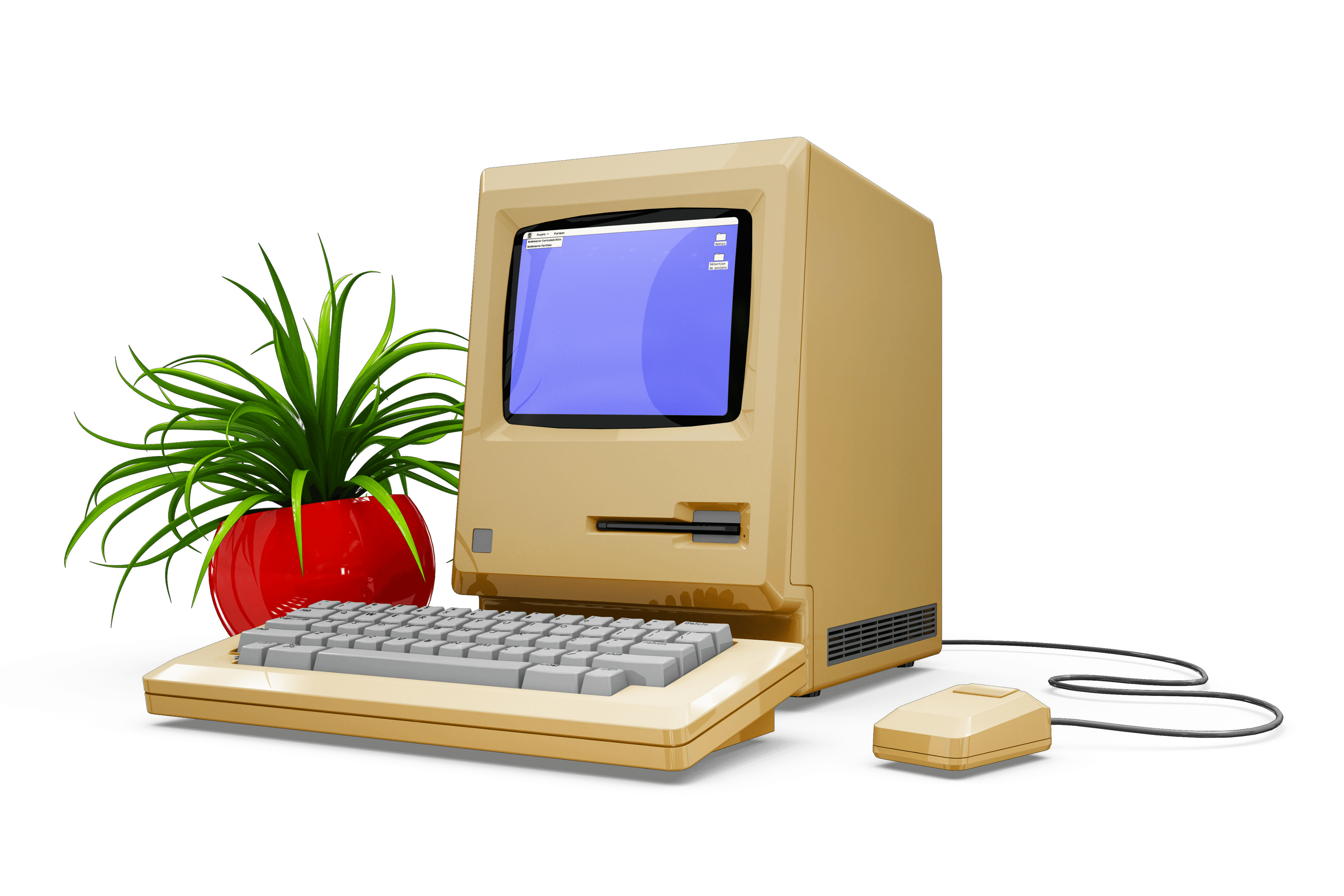
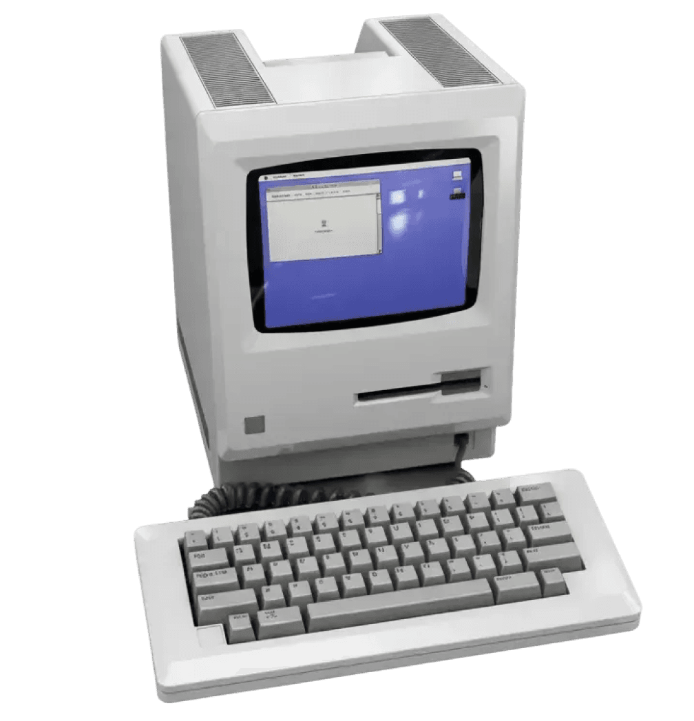
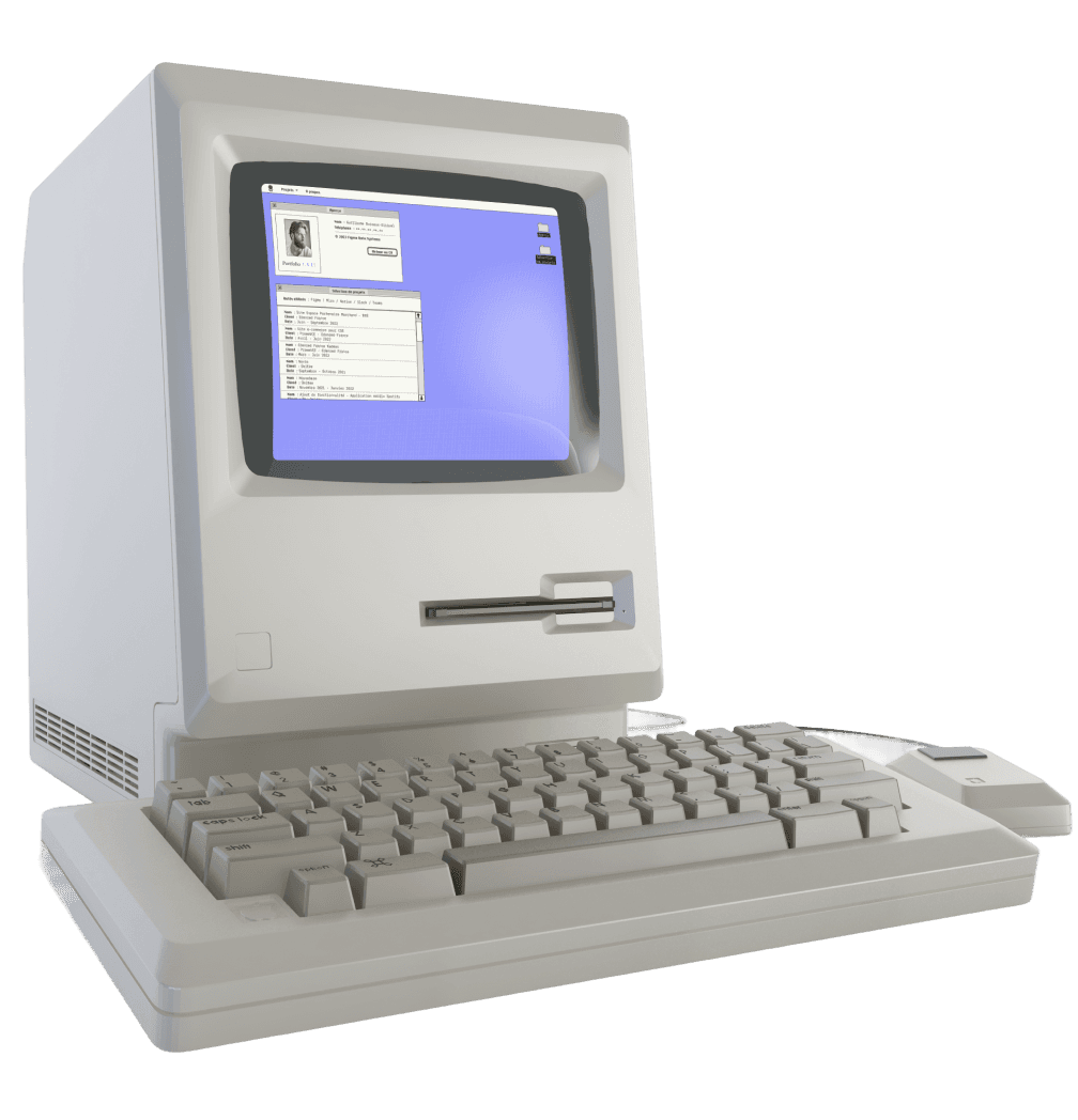
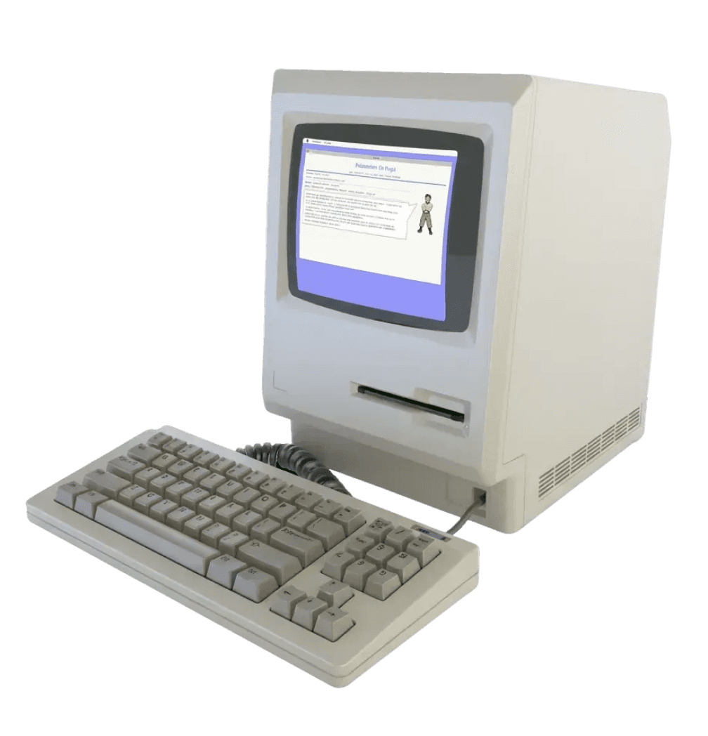
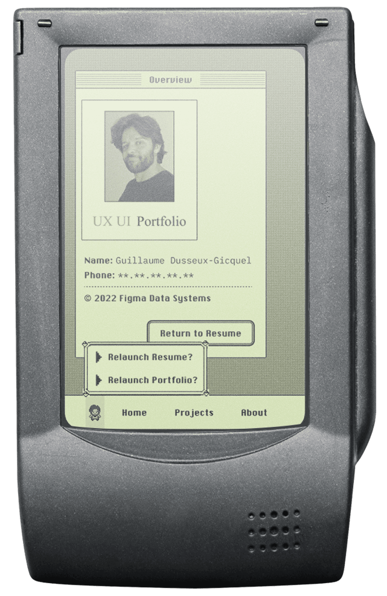
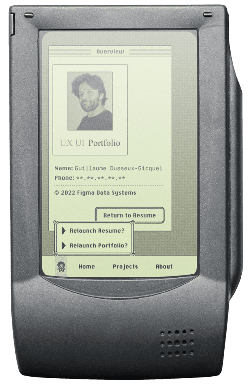
The portfolio takes the form of a classic Macintosh-inspired operating system, blending interface metaphors from the late ’80s and early ’90s with subtle influences from video games. The resume, more structured and deliberate, evokes early home computers and science-fiction interfaces, offering direct access to information through a system-like navigation.
Rather than relying on static documents, the project rethinks how operating-system logic and web navigation can coexist. Developed initially in 2022 and released this year as a live website, it serves as a personal design exploration and a concise presentation of a product designer profile, showcasing professional work across SaaS products, mobile applications, and e-commerce platforms.
A fully optimized setup, complete with a keyboard, mouse, and an unexpectedly well-watered plant.
Interactive Resume System
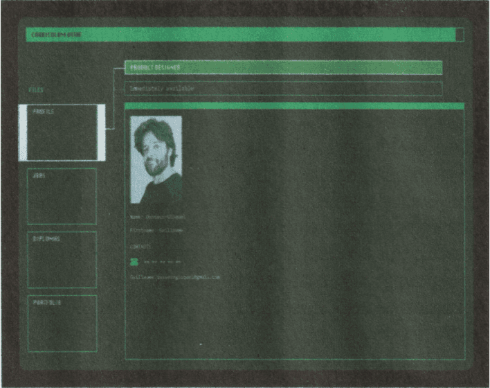
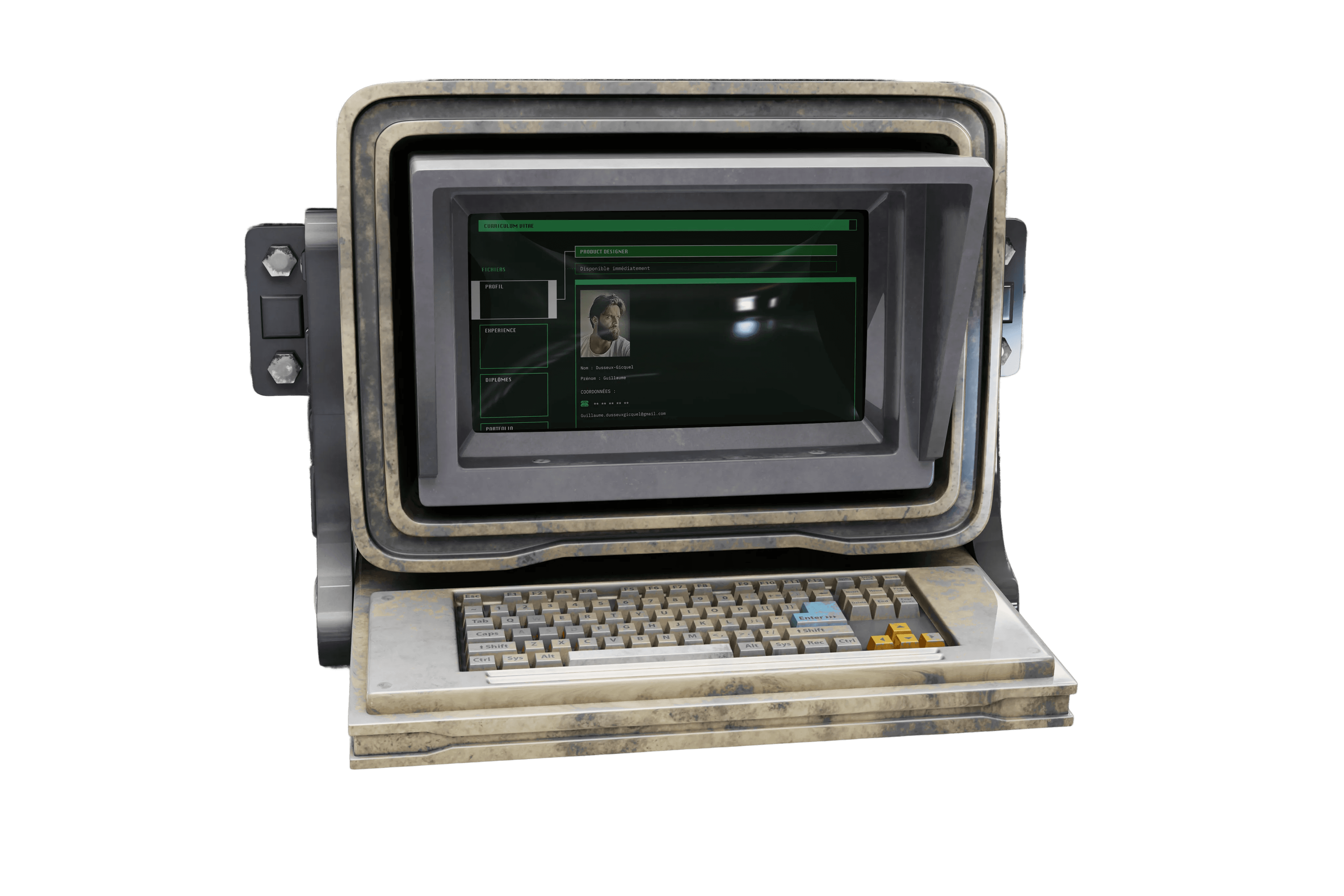
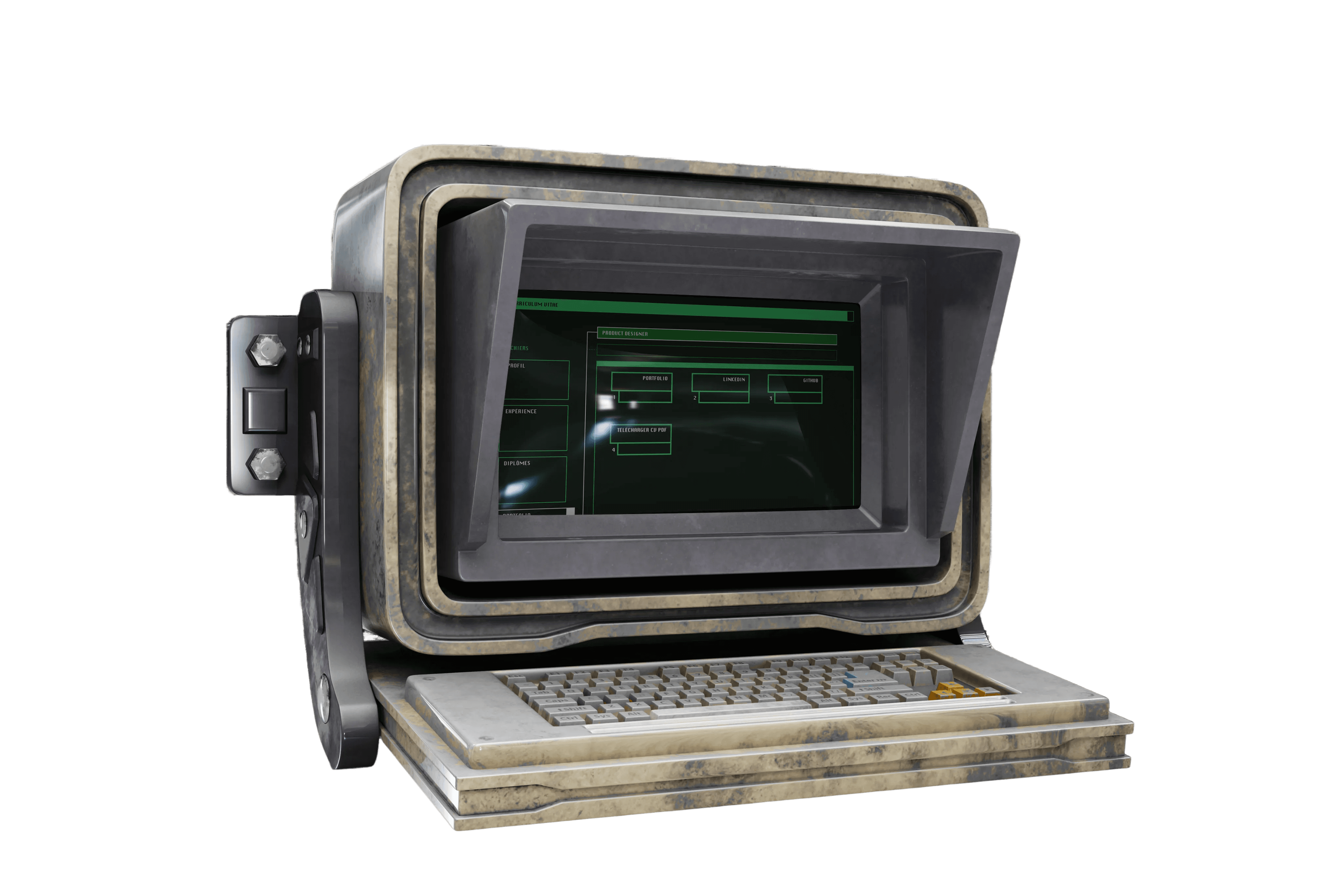
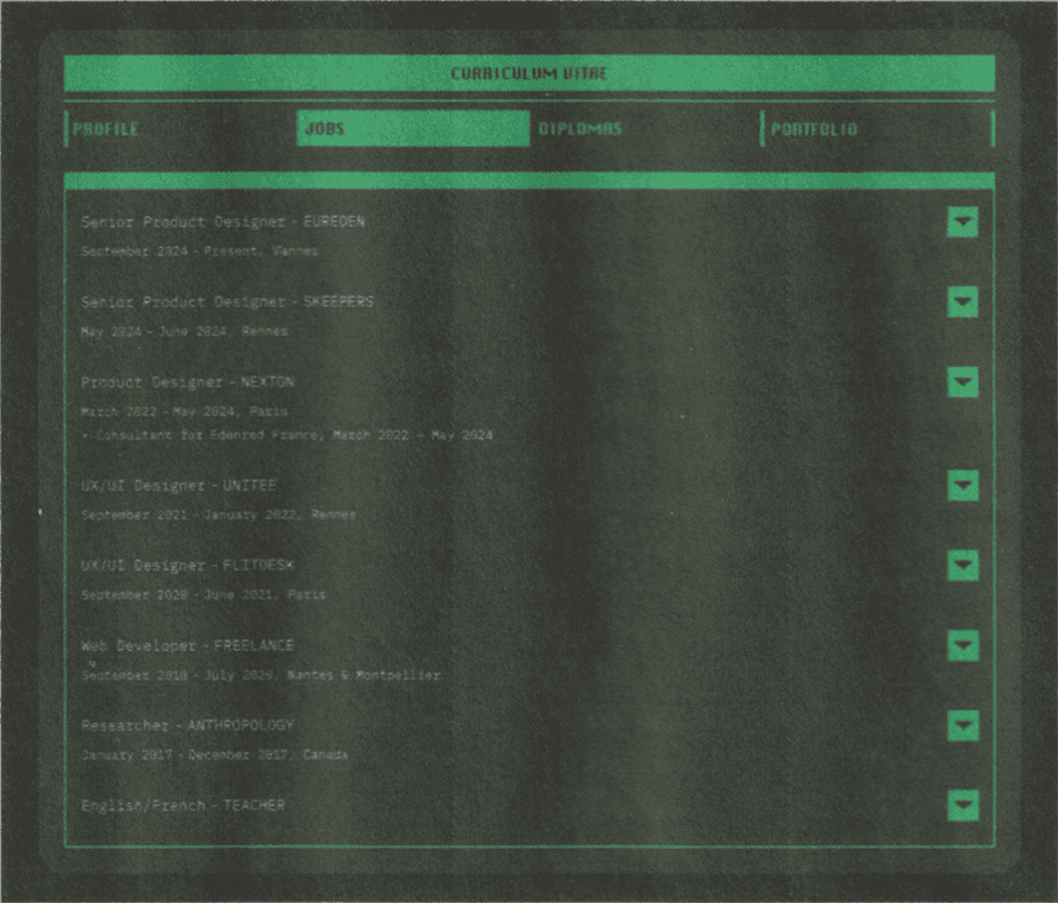
An alternative to the traditional PDF resume, this interface presents professional experience through a structured system-driven layout. Inspired by early home computers and sci-fi terminals, it provides direct access to roles and timelines.
Operating System-Inspired Portfolio
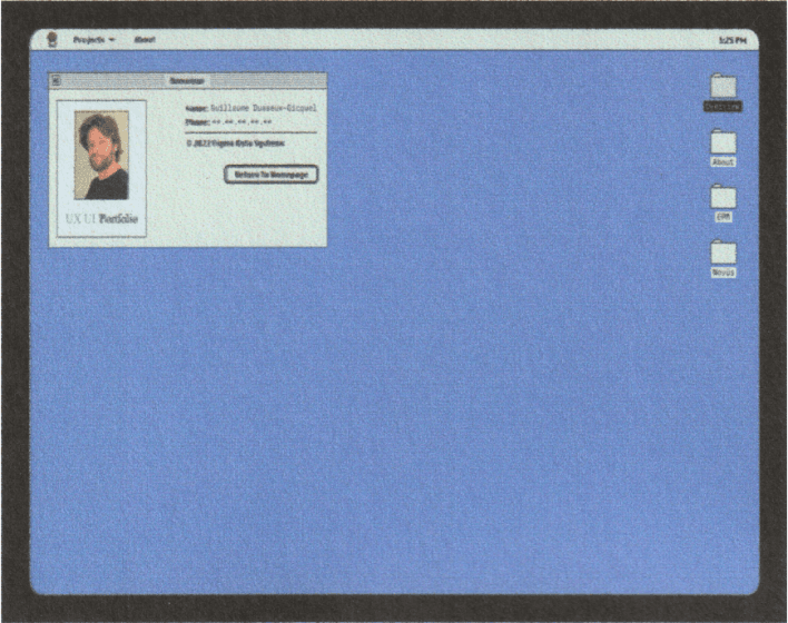
A Macintosh-inspired operating system where projects behave like desktop objects instead of static pages. Subtle video-game influences reinforce exploration and interaction.
A resume designed
like a system,
not a document.
INTERACTIVE RESUME SYSTEM, NOW ONLINE
Designed as an alternative to the traditional PDF resume, this project explores how interface logic can reshape the way professional experience is presented. Information is no longer consumed by scrolling but accessed through a structured system built around navigation, hierarchy, and interaction.
The resume is organized as a set of modules rather than pages. Roles, timelines, and details are revealed progressively through direct user actions, using expandable sections and contextual navigation. The goal is clarity, not decoration, with every interaction serving orientation and readability.
Inspired by early computer interfaces, the system prioritizes structure and intention. The interface behaves like a program rather than a page, encouraging exploration while keeping information precise, controlled, and immediately accessible.
Navigation adapts across devices while preserving the same system logic. On desktop, interaction relies on a left-aligned vertical structure, reinforcing a workstation-like experience. On tablet and mobile, navigation shifts to the top, maintaining consistency without compromising usability.
Visual feedback, subtle glitch effects, audio cues, and a short startup sequence reinforce the sensation of entering a system rather than opening a website. These elements are restrained and functional, supporting immersion without overwhelming the content.
The result is an interactive resume designed to be read through use. Information is not skimmed but accessed, unfolded, and understood through interaction, following the logic of a real interface.
Not a PDF.
Not a scroll.
A system built to be accessed.
TO BE NAVIGATED,
NOT SKIMMED.
Built to feel familiar.
play
System
The portfolio is built as a unified system rather than a collection of pages. Projects exist inside a shared environment governed by consistent rules, layouts, and behaviors.
This approach creates continuity across the experience. Once inside, users understand how the system works, how to navigate it, and how to explore projects without friction or relearning patterns.
Navigation
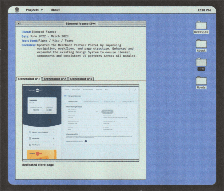
Windows
Projects are accessed through windows instead of long scrolling pages.Each project opens, closes, and exists as an independent space within the system. Navigation becomes spatial rather than linear.
Users move through the portfolio the same way they would interact with software, reinforcing clarity, control, and intent.
Interaction
Interaction is central to the experience. Every action produces a clear response, helping users understand position, state, and progression.
Transitions and feedback are restrained and purposeful. Nothing is decorative. Each interaction exists to support orientation and exploration without distracting from the content.
GDG

Visual Identity
Pixels
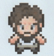
Pixel-based elements introduce a distinctive visual identity inspired by early digital interfaces. Icons, avatars, and details reference a time when interfaces were simple, expressive, and readable.
These elements add personality without breaking structure. The result is a system that feels precise, playful, and human at the same time.
A portfolio built as an interactive environment.
1990 - 1993
2022 - 2026
Designed to Adapt.
One system. Every screen.

DESKTOP TO MOBILE!
NEW!
Originally conceived as a set of isolated prototypes, both the interactive resume and the operating-system-inspired portfolio were never designed to be responsive from the start.
Early iterations focused on desktop layouts and mobile app concepts, developed independently within Figma as exploratory design artifacts rather than production-ready systems.
Transforming these static prototypes into fully responsive websites required a fundamental rethinking of structure, navigation, and hierarchy. Desktop logic had to scale down without losing clarity, while mobile constraints demanded simplification without sacrificing intent. The challenge was not only visual adaptation, but functional coherence across formats.
Each interface was reworked to preserve its system-driven behavior on every screen size.
Navigation patterns were restructured, components modularized, and interaction flows redesigned to ensure consistency from desktop to tablet to mobile. Rather than resizing layouts, the system itself was rebuilt to respond intelligently to context.
Tablet layouts were introduced as a distinct intermediate experience, bridging desktop density and mobile efficiency.
This required additional design passes to define new navigation states, spacing rules, and interaction priorities that had not existed in the original prototypes.
Responsive behavior was treated as a design problem, not a technical afterthought. Interface elements adapt based on available space, input method, and reading context, while maintaining a unified visual language and interaction logic. The result is not multiple versions of the same project, but a single system expressed differently depending on the device.
Both the resume and the portfolio function as fully responsive web experiences, accessible across platforms without compromising usability or intent. The system remains readable, navigable, and deliberate at every scale, reinforcing the idea that structure and interaction should adapt, not break, when the screen changes.
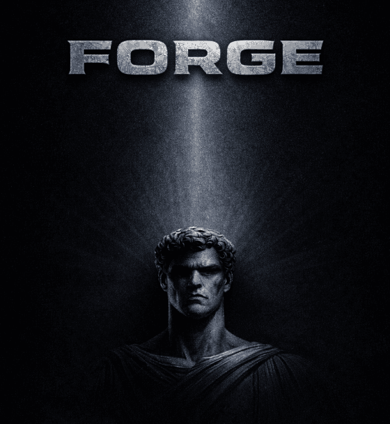
Results aren’t given
They are forged
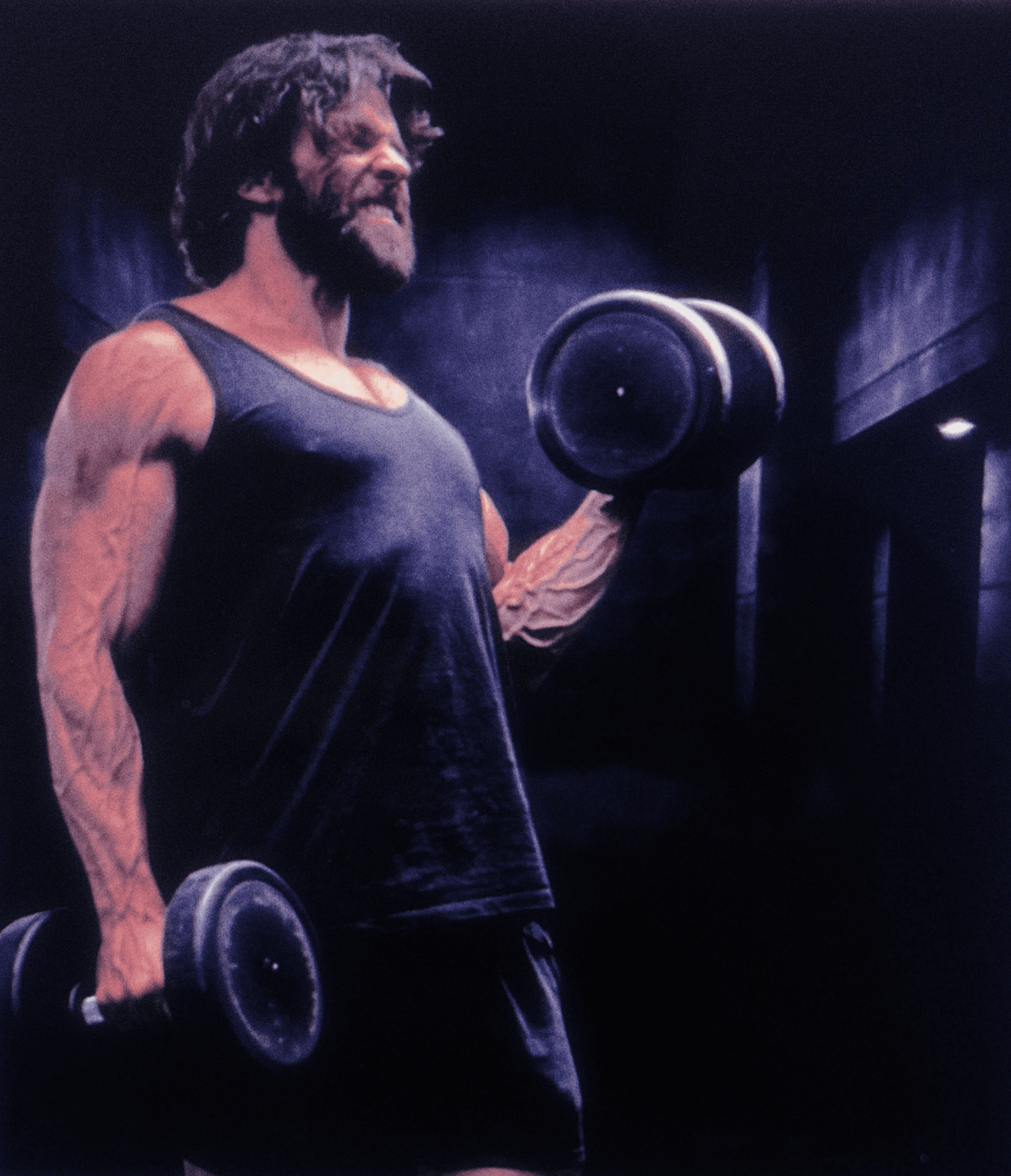
Forge began as a personal training tool. Built to track lifts, monitor progress, and stay focused on the essentials. No distractions. No inflated features. Just structure, clarity, and measurable performance. The design draws from early 2000s visual culture and tactical aesthetics. This is a personal project, practical, disciplined, and built for real use.
Future development will evolve naturally.
Work in progress
gd
Guillaume Dusseux-Gicquel
Independent Designer
Mobile App
gd

It’s here.
EDITORIAL FORMAT.
After months of work and iteration, the interactive portfolio and resume are now publicly
available.
D
esigned as an alternative to conventional portfolios and resumes, this project turns the interface itself into the portfolio. Originally conceived as a series of mobile applications and desktop
prototypes, it evolved into a fully responsive website built to bridge experimentation and real-world navigation.
What began as isolated concepts was gradually refined into a coherent system that adapts seamlessly across desktop, tablet, and mobile screens. At its core, the project brings together two complementary yet distinct experiences: an interactive portfolio and an interactive resume. Both draw from retro computer systems, yet each follows its own visual language and internal logic.
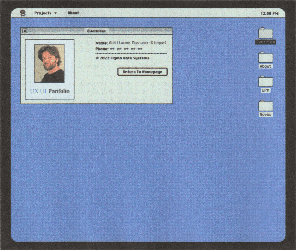
The portfolio takes the form of a classic Macintosh-inspired operating system, blending interface metaphors from the late ’80s and early ’90s with subtle influences from video games. The resume, more structured and deliberate, evokes early home computers and science-fiction interfaces, offering direct access to information through a system-like navigation.
Rather than relying on static documents, the project rethinks how operating-system logic and web navigation can coexist. Developed initially in 2022 and released this year as a live website, it serves as a personal design exploration and a concise presentation of a product designer profile, showcasing professional work across SaaS products, mobile applications, and e-commerce platforms.
Interactive Resume System
An alternative to the traditional PDF resume, this interface presents professional experience through a structured system-driven layout. Inspired by early home computers and sci-fi terminals, it provides direct access to roles and timelines.
Operating System-Inspired Portfolio
A Macintosh-inspired operating system where projects behave like desktop objects instead of static pages. Subtle video-game influences reinforce exploration and interaction.
It’s here.
EDITORIAL FORMAT.
After months of work and iteration, the interactive portfolio and resume are now publicly
available.
D
esigned as an alternative to conventional portfolios and resumes, this project turns the interface itself into the portfolio. Originally conceived as a series of mobile applications and desktop
prototypes, it evolved into a fully responsive website built to bridge experimentation and real-world navigation.
What began as isolated concepts was gradually refined into a coherent system that adapts seamlessly across desktop, tablet, and mobile screens. At its core, the project brings together two complementary yet distinct experiences: an interactive portfolio and an interactive resume. Both draw from retro computer systems, yet each follows its own visual language and internal logic.
The portfolio takes the form of a classic Macintosh-inspired operating system, blending interface metaphors from the late ’80s and early ’90s with subtle influences from video games. The resume, more structured and deliberate, evokes early home computers and science-fiction interfaces, offering direct access to information through a system-like navigation.
Rather than relying on static documents, the project rethinks how operating-system logic and web navigation can coexist. Developed initially in 2022 and released this year as a live website, it serves as a personal design exploration and a concise presentation of a product designer profile, showcasing professional work across SaaS products, mobile applications, and e-commerce platforms.
Interactive Resume System
An alternative to the traditional PDF resume, this interface presents professional experience through a structured system-driven layout. Inspired by early home computers and sci-fi terminals, it provides direct access to roles and timelines.
Operating System-Inspired Portfolio
A Macintosh-inspired operating system where projects behave like desktop objects instead of static pages. Subtle video-game influences reinforce exploration and interaction.
INTERACTIVE RESUME SYSTEM, NOW ONLINE
A resume designed
like a system,
not a document.
Designed as an alternative to the traditional PDF resume, this project explores how interface logic can reshape the way professional experience is presented. Information is no longer consumed by scrolling but accessed through a structured system built around navigation, hierarchy, and interaction.
The resume is organized as a set of modules rather than pages. Roles, timelines, and details are revealed progressively through direct user actions, using expandable sections and contextual navigation. The goal is clarity, not decoration, with every interaction serving orientation and readability.
Inspired by early computer interfaces, the system prioritizes structure and intention. The interface behaves like a program rather than a page, encouraging exploration while keeping information precise, controlled, and immediately accessible.
Navigation adapts across devices while preserving the same system logic. On desktop, interaction relies on a left-aligned vertical structure, reinforcing a workstation-like experience. On tablet and mobile, navigation shifts to the top, maintaining consistency without compromising usability.
Visual feedback, subtle glitch effects, audio cues, and a short startup sequence reinforce the sensation of entering a system rather than opening a website. These elements are restrained and functional, supporting immersion without overwhelming the content.
The result is an interactive resume designed to be read through use. Information is not skimmed but accessed, unfolded, and understood through interaction, following the logic of a real interface.
Not a PDF.
Not a scroll.
A system built to be accessed.
TO BE NAVIGATED,
NOT SKIMMED.
Built to feel familiar.
play
System
The portfolio is built as a unified system rather than a collection of pages. Projects exist inside a shared environment governed by consistent rules, layouts, and behaviors.
This approach creates continuity across the experience. Once inside, users understand how the system works, how to navigate it, and how to explore projects without friction or relearning patterns.
Navigation
Windows
Projects are accessed through windows instead of long scrolling pages.Each project opens, closes, and exists as an independent space within the system. Navigation becomes spatial rather than linear.
Users move through the portfolio the same way they would interact with software, reinforcing clarity, control, and intent.
Interaction
Interaction is central to the experience.
Every action produces a clear response, helping users understand position, state, and progression.
Transitions and feedback are restrained and purposeful. Nothing is decorative. Each interaction exists to support orientation and exploration without distracting from the content.
GDG
Visual Identity
Pixels
Pixel-based elements introduce a distinctive visual identity inspired by early digital interfaces. Icons, avatars, and details reference a time when interfaces were simple, expressive, and readable.
These elements add personality without breaking structure. The result is a system that feels precise, playful, and human at the same time.
A portfolio built as an interactive environment.
1990 - 1993
2022 - 2026
Designed to Adapt.
One system. Every screen.

DESKTOP TO MOBILE!
NEW!
DESKTOP TO MOBILE!
NEW!
Originally conceived as a set of isolated prototypes, both the interactive resume and the operating-system-inspired portfolio were never designed to be responsive from the start.
Early iterations focused on desktop layouts and mobile app concepts, developed independently within Figma as exploratory design artifacts rather than production-ready systems.
Transforming these static prototypes into fully responsive websites required a fundamental rethinking of structure, navigation, and hierarchy. Desktop logic had to scale down without losing clarity, while mobile constraints demanded simplification without sacrificing intent. The challenge was not only visual adaptation, but functional coherence across formats. Each interface was reworked to preserve its system-driven behavior on every screen size.
Navigation patterns were restructured, components modularized, and interaction flows redesigned to ensure consistency from desktop to tablet to mobile. Rather than resizing layouts, the system itself was rebuilt to respond intelligently to context.
Tablet layouts were introduced as a distinct intermediate experience, bridging desktop density and mobile efficiency.
This required additional design passes to define new navigation states, spacing rules, and interaction priorities that had not existed in the original prototypes.
Responsive behavior was treated as a design problem, not a technical afterthought. Interface elements adapt based on available space, input method, and reading context, while maintaining a unified visual language and interaction logic. The result is not multiple versions of the same project, but a single system expressed differently depending on the device.
Both the resume and the portfolio function as fully responsive web experiences, accessible across platforms without compromising usability or intent. The system remains readable, navigable, and deliberate at every scale, reinforcing the idea that structure and interaction should adapt, not break, when the screen changes.
Results aren’t given
They are forged
Results aren’t given
They are forged
Forge began as a personal training tool. Built to track lifts, monitor progress, and stay focused on the essentials. No distractions. No inflated features. Just structure, clarity, and measurable performance. The design draws from early 2000s visual culture and tactical aesthetics. This is a personal project, practical, disciplined, and built for real use.
Future development will evolve naturally.
Work in progress
gd
Guillaume Dusseux-Gicquel
Independent Designer
Mobile App
gd

It’s here.
EDITORIAL FORMAT.
After months of work and iteration, the interactive portfolio and resume are now publicly
available.
D
esigned as an alternative to conventional portfolios and resumes, this project
turns the interface itself into the portfolio. Originally conceived as a series of mobile applications and desktop prototypes, it evolved into a fully responsive website built to bridge experimentation and real-world navigation.
What began as isolated concepts was gradually refined into a coherent system that adapts seamlessly across desktop, tablet, and mobile screens. At its core, the project brings together two complementary yet distinct experiences: an interactive portfolio and an interactive resume. Both draw from retro computer systems, yet each follows its own visual language and internal logic.
The portfolio takes the form of a classic Macintosh-inspired operating system, blending interface metaphors from the late ’80s and early ’90s with subtle influences from video games. The resume, more structured and deliberate, evokes early home computers and science-fiction interfaces, offering direct access to information through a system-like navigation.
Rather than relying on static documents, the project rethinks how operating-system logic and web navigation can coexist. Developed initially in 2022 and released this year as a live website, it serves as a personal design exploration and a concise presentation of a product designer profile, showcasing professional work across SaaS products, mobile applications, and e-commerce platforms.
Interactive Resume System
An alternative to the traditional PDF resume, this interface presents professional experience through a structured system-driven layout. Inspired by early home computers and sci-fi terminals, it provides direct access to roles and timelines.
Operating System-Inspired Portfolio
A Macintosh-inspired operating system where projects behave like desktop objects instead of static pages. Subtle video-game influences reinforce exploration and interaction.
INTERACTIVE RESUME SYSTEM, NOW ONLINE
A resume designed
like a system,
not a document.
Designed as an alternative to the traditional PDF resume, this project explores how interface logic can reshape the way professional experience is presented. Information is no longer consumed by scrolling but accessed through a structured system built around navigation, hierarchy, and interaction.
The resume is organized as a set of modules rather than pages. Roles, timelines, and details are revealed progressively through direct user actions, using expandable sections and contextual navigation. The goal is clarity, not decoration, with every interaction serving orientation and readability.
Inspired by early computer interfaces, the system prioritizes structure and intention. The interface behaves like a program rather than a page, encouraging exploration while keeping information precise, controlled, and immediately accessible.
Navigation adapts across devices while preserving the same system logic. On desktop, interaction relies on a left-aligned vertical structure, reinforcing a workstation-like experience. On tablet and mobile, navigation shifts to the top, maintaining consistency without compromising usability.
Visual feedback, subtle glitch effects, audio cues, and a short startup sequence reinforce the sensation of entering a system rather than opening a website. These elements are restrained and functional, supporting immersion without overwhelming the content.
The result is an interactive resume designed to be read through use. Information is not skimmed but accessed, unfolded, and understood through interaction, following the logic of a real interface.
Not a PDF.
Not a scroll.
A system built to be accessed.
TO BE NAVIGATED,
NOT SKIMMED.
Built to feel familiar.
play
System
The portfolio is built as a unified system rather than a collection of pages. Projects exist inside a shared environment governed by consistent rules, layouts, and behaviors.
This approach creates continuity across the experience. Once inside, users understand how the system works, how to navigate it, and how to explore projects without friction or relearning patterns.
Navigation
Windows
Projects are accessed through windows instead of long scrolling pages.Each project opens, closes, and exists as an independent space within the system. Navigation becomes spatial rather than linear.
Users move through the portfolio the same way they would interact with software, reinforcing clarity, control, and intent.
Interaction
Interaction is central to the experience.
Every action produces a clear response, helping users understand position, state, and progression.
Transitions and feedback are restrained and purposeful. Nothing is decorative. Each interaction exists to support orientation and exploration without distracting from the content.
GDG
Visual Identity
Pixels
Pixel-based elements introduce a distinctive visual identity inspired by early digital interfaces. Icons, avatars, and details reference a time when interfaces were simple, expressive, and readable.
These elements add personality without breaking structure. The result is a system that feels precise, playful, and human at the same time.
A portfolio built as an interactive environment.
1990 - 1993
2022 - 2026
Designed to Adapt.
One system. Every screen.


DESKTOP TO MOBILE!
NEW!
Originally conceived as a set of isolated prototypes, both the interactive resume and the operating-system-inspired portfolio were never designed to be responsive from the start.
Early iterations focused on desktop layouts and mobile app concepts, developed independently within Figma as exploratory design artifacts rather than production-ready systems.
Transforming these static prototypes into fully responsive websites required a fundamental rethinking of structure, navigation, and hierarchy. Desktop logic had to scale down without losing clarity, while mobile constraints demanded simplification without sacrificing intent. The challenge was not only visual adaptation, but functional coherence across formats. Each interface was reworked to preserve its system-driven behavior on every screen size.
Navigation patterns were restructured, components modularized, and interaction flows redesigned to ensure consistency from desktop to tablet to mobile. Rather than resizing layouts, the system itself was rebuilt to respond intelligently to context.
Tablet layouts were introduced as a distinct intermediate experience, bridging desktop density and mobile efficiency.
This required additional design passes to define new navigation states, spacing rules, and interaction priorities that had not existed in the original prototypes.
Responsive behavior was treated as a design problem, not a technical afterthought. Interface elements adapt based on available space, input method, and reading context, while maintaining a unified visual language and interaction logic. The result is not multiple versions of the same project, but a single system expressed differently depending on the device.
Both the resume and the portfolio function as fully responsive web experiences, accessible across platforms without compromising usability or intent. The system remains readable, navigable, and deliberate at every scale, reinforcing the idea that structure and interaction should adapt, not break, when the screen changes.

Results aren’t given
They are forged
Results aren’t given
They are forged
Forge began as a personal training tool. Built to track lifts, monitor progress, and stay focused on the essentials. No distractions. No inflated features. Just structure, clarity, and measurable performance. The design draws from early 2000s visual culture and tactical aesthetics. This is a personal project, practical, disciplined, and built for real use. Future development will evolve naturally.
Work in progress.
gd
Guillaume Dusseux-Gicquel
Independent Designer
Mobile App
gd